My 3 Favorite Websites!
Functionality vs. Visual Appeal!
Snowboardermag.com
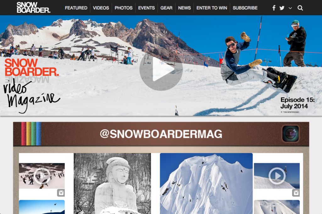
Snowboardermag.com is one of my favorite websites because why? You guessed it because I love to snowboard! This website is not the most fancy or elegant but it gets the job done. Snowboardermag.com is primarily a website for 'snowboard enthusiasts' to check in and see what is going on in the world of snowboarding. The site includes videos, photos, and news about what is happening in the snowboard community. At first glance the website is very simple and is set up almost like a blog itself. The main focal point is whatever video they put right at the top of the page, which takes up most of the screen and doesn't leave much else to see without scrolling down. They do have a clean navigation bar at the top with large, easy to read text that makes it simple to switch categories. The navigation bar has a z-index of 1 so it is always on your screen making it easy to cruise through the website without searching too hard. All of the buttons on the navigation also include nice drop-down menu's to further simplify your selections. Large photos on all of the different posts makes this site visually pleasing, but on the contrary makes for a lot of scrolling to get from the top to the bottom of the page.
After leaving the home page, most pages are set up very similiar to the home page. They like to utilize the 'blog-style' site, organizing content by the date it was added. Advertisements on category pages include audio and video, which I find disctracts you from the content within the page. This is great marketing I am sure, but I find it quite frustrating to have an audio distraction while I am trying to scroll through content. The pages seem to get longer once you are off the main page and it is a lot of content per page to be able to focus on one story.
Overall I think this is a great website because of the content but visually is not that well put together. It is overstimulating with pictures and you feel as though you have to travel soo far from the beginning to find what you are looking for. After leaving the site I am usually excited to go snowboarding and left thinking about snowboarding for a while afterwords so they do a good job accomplishing that. They do not sell much on the site, other than possibly magazine subscriptions, so I have never bought anything from snowboardermag.com. I think an important point that I have realized here is that a website's functionality and visual appeal are only as important as the content within the site. Even if a site is set up poorly but includes the specific content people want they will use it when they have too. The key is having the content that people are looking for while also have a clean, easy to navigate website that makes users want to come back again and again.
Facebook.com
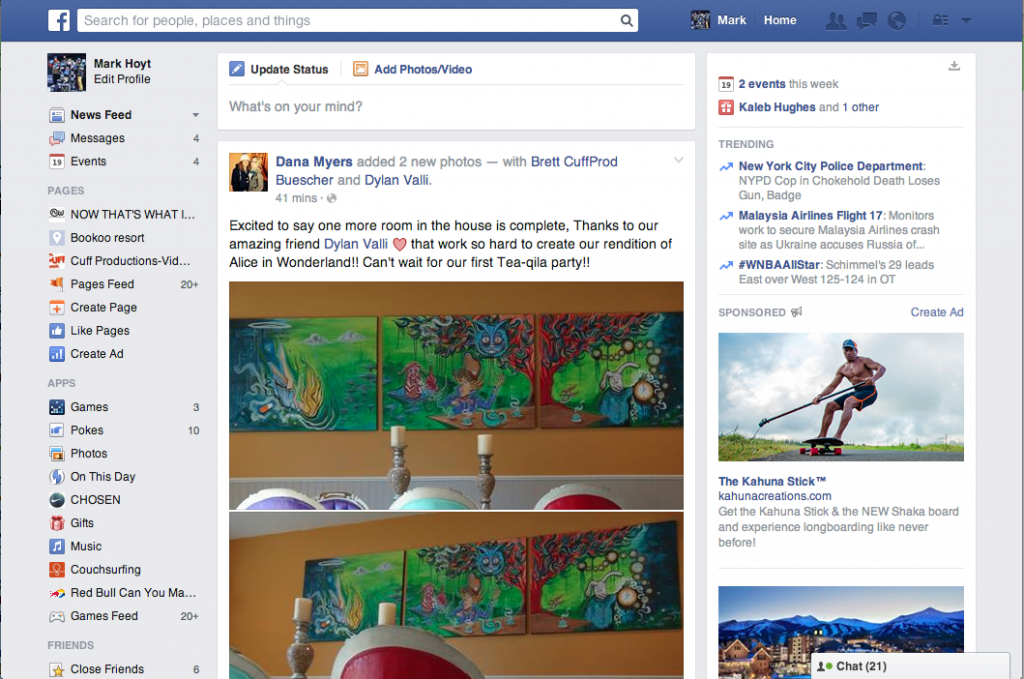
Facebook is not necesarily one of my favorite website's but like most people I can say that it is one of the sites that I browse the most. For the most part the homepage on facebook.com is quite cluttered and hard to navigate unless you use it often. There are a lot of buttons and links that I have never even used within my own homepage. Upon opening my homepage my attention is usually drawn towards my notifications in the upper right hand corner. Whether this is the color contrast of red-to-blue or just an instinct to see what is going on in my own 'personal world' I am not sure. After checking my notifications I usually go straight towards my news feed. Browsing through the newsfeed is very visually stimulating because of the plethora of photos and videos that usually fill my news feed. The rest of the home page includes
Facebook.com has a very important function for myself and I am sure it is the same for many other people. 'Boredom' is probably the main reason for most of the time spent of facebook.com. When people are bored these days they get on facebook. When I myself am bored sometimes I will just get on facebook and scroll through my news-feed until I realize how much of my life I am wasting doing so. The beneficial side of this is that it makes it easy to see what some of your friends that you don't speak to often are doing. Facebook is a great tool to connect with friends that are far away, but I also find that it disconnects people, instead of calling to check in with a friend you can just feel satisfied that you saw what they are doing through facebook.
Overall I think facebook.com is an amazing website that makes people feel closer to people they know and lets friendships and communication continue with people that you might not of continued communication with otherwise. Throughout my snowboarding career facebook.com has been great for these reasons as well as many others. I have been able to stay in contact with tons of people that I have met throughout the world that I might not of done otherwise. On one hand this is great because you keep those connections but conversely it also makes me less likely to call some of my closer friends because I feel like I know what they are doing anyways. Facebook doesn't sell anything other than adds and adspace I don't believe. Very rarely do I even notice these adds anymore except for the ones within my news feed that I try and ignore every day. Facebook seems cluttered and kind of simple to me but I think the purpose of the simplicity is to keep the user focused on their own personal content and not a bunch of facebook mumbo-jumbo.
Amazon.com
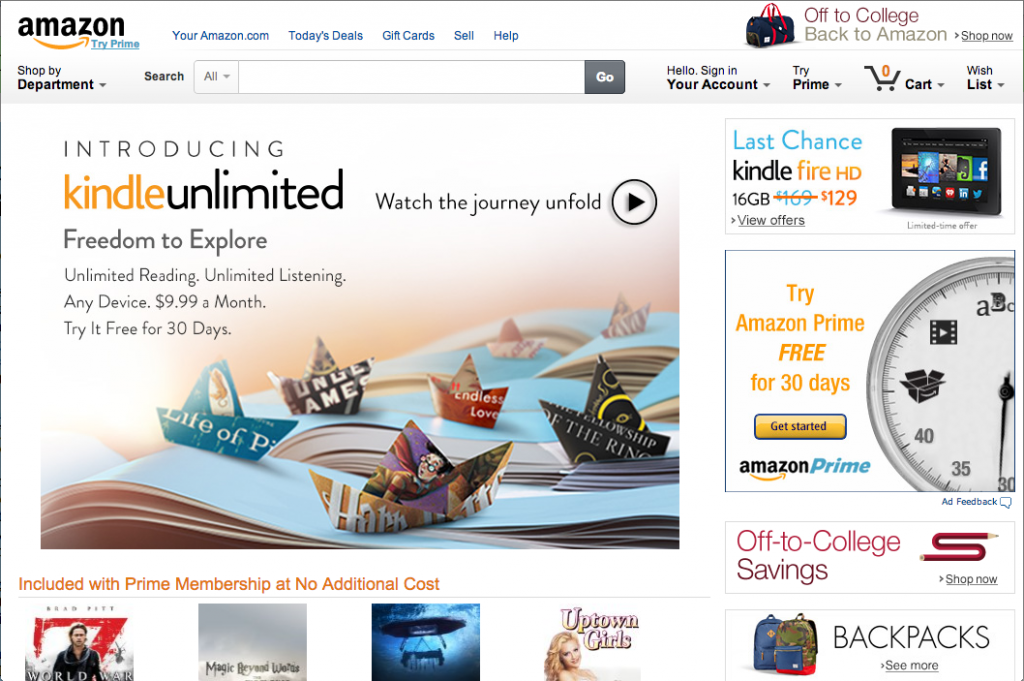
Amazon.com is an amazing website. I have done a lot of shopping on amazon for many reasons. One of the main reasons to shop on amazon is the almost endless possibilites of things to buy. I have bought things from books and DVD's to tattoo supplies all on Amazon, it is almost your 'one-stop-shopping' destination online. The prices on amazon are great as well as having the choice to buy used or new items is great. Amazon.com is full of shopping choices and even price comparing. With a membership to Amazon prime you can get free fast shipping as well as DVD's on demand and other perks.
The site itself is simple, elegant and easy to navigate. The home page is well organized and not filled with too much information. The main focal point is obviously the large picture right on the front page but I find that the search bar is also easy to recognize and use. You have the choice to choose a category for your search or just search within them all which I think gives people more relevant results and sometimes even some that they might not of searched for in the first place.
Overall I think that Amazon.com is one of the absolute best shopping websites. Not just because of the variety of items to buy but because of the overall easy navigation of the website and simplicity of the design. I have bought a lot of things on amazon.com and will continue to use this site for purchasing needs.